- Liudmyla Sha
- 24 Oct 2017
- Comments Off on 5 Rules to Improve Your Site Navigation Menu Usability
Navigation menu is like a road map for your website visitors. If it’s clear and simple, users are more likely to stay and explore the content you want them to engage with.
Quality assurance specialists at Decide Web Development are happy to share these 5 basic rules and recommendations that will help you improve your site navigation menu usability.
1. Keep it clear and simple
Do yourself a favor and don’t puzzle it, don’t break your back to make it super special and simply don’t think about it too much. When you focus on making your main menu super creative, chances are you’re making it too complicated.
- Limit the quantity of your menu items. Too many items will disperse visitor’s attention and make your website look overcrowded and desperate. Limit the number of main menu links to 5 or 7 at the absolute maximum. If you have more information you want to include in the main menu, you may consider a vertical menu instead or organizing subcategories via drop-down submenu.
- Use obvious and simple terms. Don’t use words that require users to click on the link to figure out where it would take them to. Names like “Ta da!” or “Fun Stuff” may attract attention but they’re not clear and could mean anything. Terms like “Showroom” are confusing too, it could refer to company’s portfolio or its work process – who knows… Make sure to also avoid generic words like “Products” or “Services” that once again say nothing unless you click them.
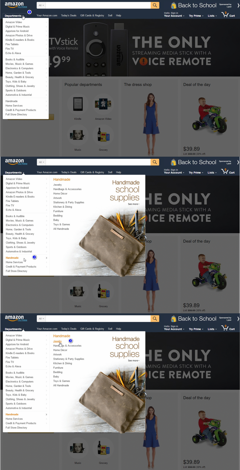
- Don’t go too deep. Ideally, we’d suggest to avoid drop-down menus at all. When running an online store or having lots of services to offer, the rule is that no page should be farther than 3 clicks (including mouseovers) away from your homepage. This means having more than 3 levels of navigation menu is a big NO. Even if your menu is a product catalog, don’t go deeper than three levels. Amazon’s “Departments” menu is a good example of a big but still user-friendly navigation menu, let’s count to 3 together.

2. Put it in an expected place
Whatever your main menu looks like, the best place for it is still across the top or down the left side of the page. In terms of site navigation, you should give your visitors what they expect. Sometimes, designers forget about navigation menu usability on their way to creating a masterpiece. Although, there are no limits to creativity, let’s not forget your site menu is not the right place to show how original and unique you are.
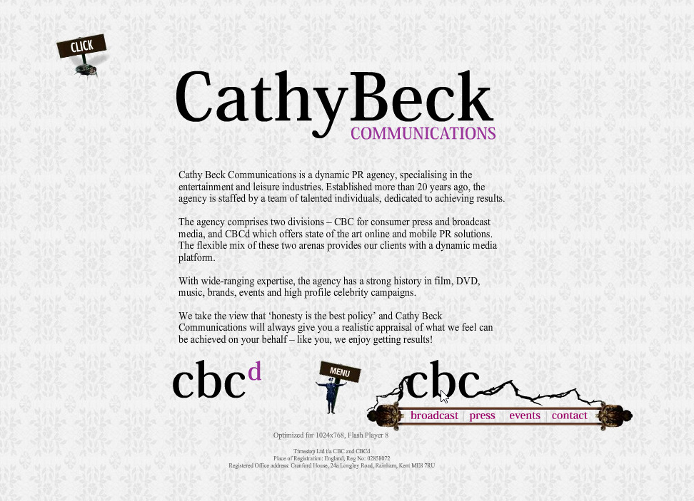
As much as we love Cathy Beck’s creative website, it still takes a while to locate the menu. Put your main navigation in standard places, where it is visible and easy to find. This can get you higher conversions and less bounce rate, which is what we all want.

3. Have it stick to one place
This is very important in terms of navigation menu usability and is actually very easy to do. The trick is to have it at a fixed position, so that it’s still visible when user scrolls down the page. A good example is the top menu on our Decide Web Development website. When you try it once, you wonder how you lived without it all this time. It’s just very convenient to always have the site navigation reachable no matter what part of the website you’re at. It is especially convenient for long pages like ours, but even for websites with short page layout, your menu should be sticky, because users may still have to scroll down on smaller screens.

4. Make it intuitive and interactive
- Indicate user’s location. This one is very important. Users should always be aware of where they are within your website. Make the link of an active page/section user’s at distinctly different from the rest navigation menu items.
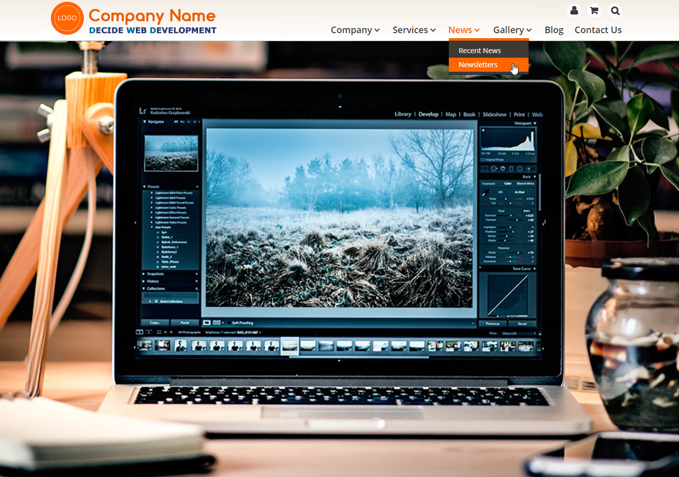
This can be achieved by somehow highlighting the link, i.e. changing the link’s color, background or underlining it – whatever looks best considering your website design. You can see how we did it on the example below. - Add hover effect. Menu item should have some sort of a highlighting effect on a mouseover. It’s important that the effect is the same as the one used to indicate an active page user is at, as mentioned above.
- Indicate drop-down menu by an arrow. If you don’t include an arrow for navigation items that have hidden sub-items, many users will obviously have no idea it’s there. Of course, as mentioned above, it’s better when there are no dropdowns to begin with. If there are, though, there should be a clear clue that the menu item is going to reveal more options. Not only that the drop-down menu should be indicated by an arrow, it should drop down on a mouseover, not a click. This is all expected by users, thus, increases your navigation menu usability.
Designer’s Studio, one of our most recently created websites – is a good example of how an intuitive and interactive main menu should look and function.

5. Make it Responsive
Optimizing your site menu for small devices can be challenging and tricky. Especially if it’s complex and has multiple levels. Arranging website content using Responsive design technique, in fact, deserves a whole separate article. Meanwhile, let’s just say that optimizing the main menu for mobile viewers is a must. The growth of mobile devices usage is unstoppable!
Drop-down menu remains the most popular way to structure menu content on mobile devices, but it has to be done right and carefully. Using a “hamburger menu” would be a good idea. A “hamburger menu” is a square icon made up of three horizontal lines. It’s normally placed at the top right site area and is expected by mobile users.
Clicking the icon should reveal the drop-down navigation menu. At this point, it’s important that it drops down smoothly and that every item is big enough for users to hit it with a finger. It’s also important that a multi-level menu demonstrates a clear structure. Users should be able to easily get rid of the drop-down list on their small screen by hitting a dropdown-free area or the menu icon itself. It won’t hurt to additionally include a closing “x” icon for that purpose. An example of a simple user-friendly hamburger menu can be seen on our Decide Web Development website.

Without a doubt, website navigation plays one of the key roles in creating a great user experience. As you can see, most of the principles of a user-friendly main menu stated above are pretty obvious and easy to do, yet too many websites make a mistake neglecting usability. Make sure your website isn’t one of them and if you need a hand – contact us for free consultation and/or a price quote.